The Wooden Floor
40th Anniversary Brand Refresh
For the 40th anniversary of the organization, the CEO and Board of Directors authorized the official refresh of the brand.
The Wooden Floor is an acclaimed educational nonprofit organization that uses dance in combination with academic advising, tutoring, college preparation, and family services to ensure well-being of at-risk students to propel them to higher education. The organization, although 40 years old, had struggled with its branding. Originally founded as Saint Joseph Ballet by local nuns, The Wooden Floor, no longer led by nuns, grew out of teaching ballet and pivoted towards implementing modern dance. Its name defined everything the organization was not. In 2009, the organization renamed to The Wooden Floor, which signified the firm foundation but soft landing of padded wooden planks in dance studios. As fitting and metaphorical the new name was, the 2009 logo was rushed and never truly liked by the staff as well as constituents. In 2022, the Board of Directors approved the marketing team and myself, as a sole designer, to come up with a new logo and assets.
Started with a dysfunctional logo
There were multiple issues with the old logo. First was incosistent use,
Planning
The team agreed the new logo should not only use an interesting new typeface, but also an icon, that inspires, connects, and represents the community that the organization serves.
We explored different directions for the icon. Color blocks, roof of the organization’s unique building, initials wordmark only, and four Os in the name of the organization.
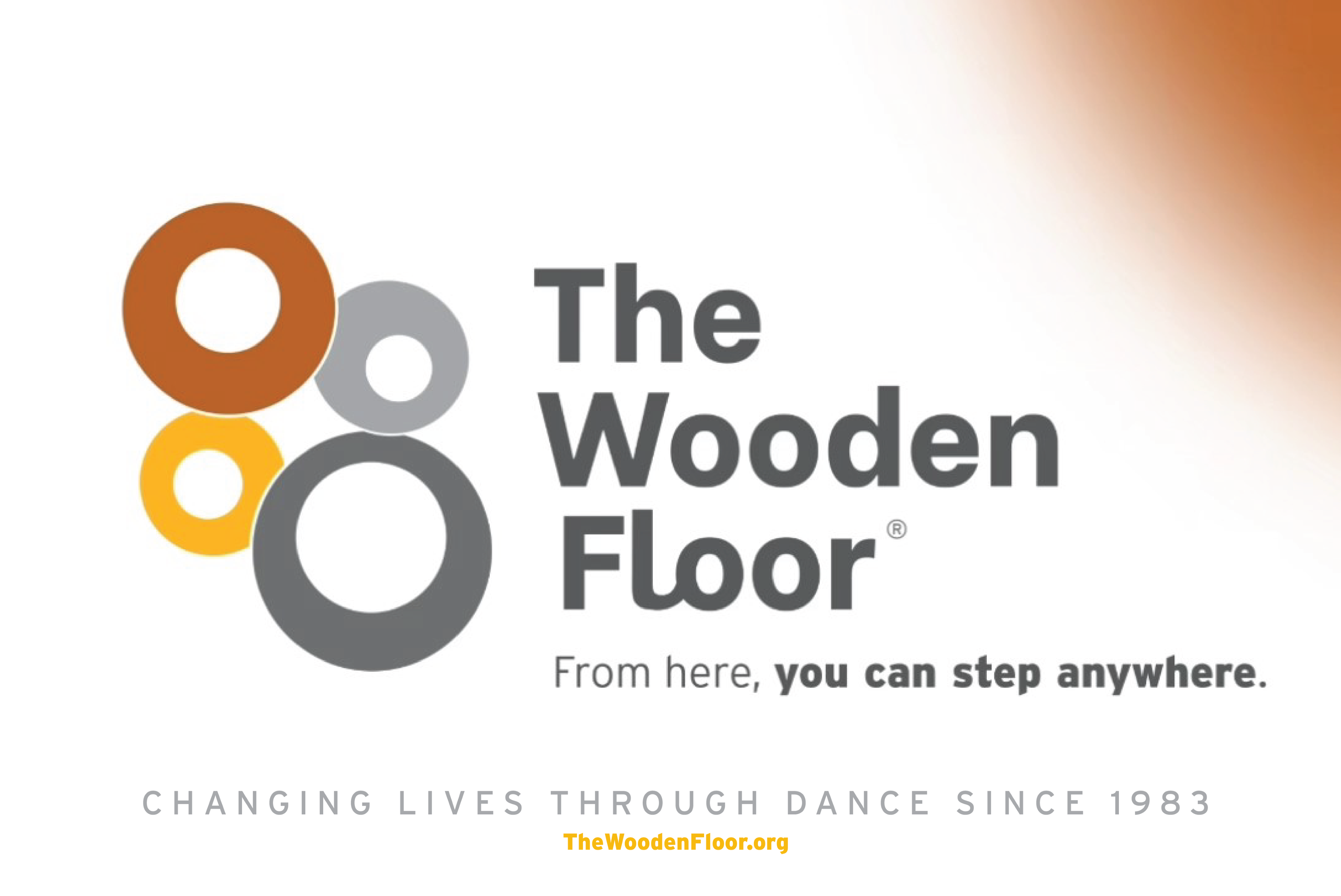
Final Delivery
By playing with the four Os in the organization’s name, we tapped into an abstract imagery of four heads/people coming together from above. By making each “O”/ head different size, we wanted to portray the different members of The Wooden Floor community coming together: The student, parent, staff, and supporter. Additionally, we added a slightly muted terracotta color to expand on the existing color palette of the organization. The leadership of the organization, appreciated The Wooden Floor’s original but limited color palette that kept the organization classy and not too primary or colorful. We, therefore, selected a complimenting color that expanded on the classiness of the organization but added depth and dimension to the visual and as well as metaphorical representation of all services provided by the organization.
A new set of versatile logos
We created logos for every use case, and also adding a vertical version, primarily designed for social media/profile pictures, to make the logo versatile and flexible.
Brand new assets
With a new logo come redesigned collateral, merchandise, and assets to officially introduce the logo to our consituents.
New Changes Codified
We rebuilt the official style guide, codifying logo meaning, structure, uses, logo no-no’s, colors, and type.
Animated Logo
The logo comes alive by moving and “dancing around” to come together, “hug” and release into its formal position. Additionally, the letter L extends to create a unique typographic element that creates a sense of connection.
Real Life Usage
The Wooden Floor
40th Anniversary Brand Refresh
For the 40th anniversary of the organization, the CEO and Board of Directors authorized the official refresh of the brand.
The Wooden Floor is an acclaimed educational nonprofit organization that uses dance in combination with academic advising, tutoring, college preparation, and family services to ensure well-being of at-risk students to propel them to higher education. The organization, although 40 years old, had struggled with its branding. Originally founded as Saint Joseph Ballet by local nuns, The Wooden Floor, no longer led by nuns, grew out of teaching ballet and pivoted towards implementing modern dance. Its name defined everything the organization was not. In 2009, the organization renamed to The Wooden Floor, which signified the firm foundation but soft landing of padded wooden planks in dance studios. As fitting and metaphorical the new name was, the 2009 logo was rushed and never truly liked by the staff as well as constituents. In 2022, the Board of Directors approved the marketing team and myself, as a sole designer, to come up with a new logo and assets.
Started with a dysfunctional logo
There were multiple issues with the old logo. First was incosistent use,
Planning
The team agreed the new logo should not only use an interesting new typeface, but also an icon, that inspires, connects, and represents the community that the organization serves.
We explored different directions for the icon. Color blocks, roof of the organization’s unique building, initials wordmark only, and four Os in the name of the organization.
Final Delivery
By playing with the four Os in the organization’s name, we tapped into an abstract imagery of four heads/people coming together from above. By making each “O”/ head different size, we wanted to portray the different members of The Wooden Floor community coming together: The student, parent, staff, and supporter. Additionally, we added a slightly muted terracotta color to expand on the existing color palette of the organization. The leadership of the organization, appreciated The Wooden Floor’s original but limited color palette that kept the organization classy and not too primary or colorful. We, therefore, selected a complimenting color that expanded on the classiness of the organization but added depth and dimension to the visual and as well as metaphorical representation of all services provided by the organization.
A new set of versatile logos
We created logos for every use case, and also adding a vertical version, primarily designed for social media/profile pictures, to make the logo versatile and flexible.
Brand new assets
With a new logo come redesigned collateral, merchandise, and assets to officially introduce the logo to our consituents.
New Changes Codified
We rebuilt the official style guide, codifying logo meaning, structure, uses, logo no-no’s, colors, and type.
Animated Logo
The logo comes alive by moving and “dancing around” to come together, “hug” and release into its formal position. Additionally, the letter L extends to create a unique typographic element that creates a sense of connection.
Real Life Usage
The Wooden Floor
40th Anniversary Brand Refresh
For the 40th anniversary of the organization, the CEO and Board of Directors authorized the official refresh of the brand.
The Wooden Floor is an acclaimed educational nonprofit organization that uses dance in combination with academic advising, tutoring, college preparation, and family services to ensure well-being of at-risk students to propel them to higher education. The organization, although 40 years old, had struggled with its branding. Originally founded as Saint Joseph Ballet by local nuns, The Wooden Floor, no longer led by nuns, grew out of teaching ballet and pivoted towards implementing modern dance. Its name defined everything the organization was not. In 2009, the organization renamed to The Wooden Floor, which signified the firm foundation but soft landing of padded wooden planks in dance studios. As fitting and metaphorical the new name was, the 2009 logo was rushed and never truly liked by the staff as well as constituents. In 2022, the Board of Directors approved the marketing team and myself, as a sole designer, to come up with a new logo and assets.
Started with a dysfunctional logo
There were multiple issues with the old logo. First was inconsistent use, originally incorporating a dancer figure, which was later informally dropped, leaving the logo only as a slanted wordmark with extreme horizontal proportions, making it hard to fit.
Planning
The team agreed the new logo should not only use an interesting new typeface, but also an icon, that inspires, connects, and represents the community that the organization serves.
We explored different directions for the icon. Color blocks, roof of the organization’s unique building, initials wordmark only, and four Os in the name of the organization.
Final Delivery
By playing with the four Os in the organization’s name, we tapped into an abstract imagery of four heads/people coming together from above. By making each “O”/ head different size, we wanted to portray the different members of The Wooden Floor community coming together: The student, parent, staff, and supporter. Additionally, we added a slightly muted terracotta color to expand on the existing color palette of the organization. The leadership of the organization, appreciated The Wooden Floor’s original but limited color palette that kept the organization classy and not too primary or colorful. We, therefore, selected a complimenting color that expanded on the classiness of the organization but added depth and dimension to the visual and as well as metaphorical representation of all services provided by the organization.
A new set of versatile logos
We created logos for every use case, and also adding a vertical version, primarily designed for social media/profile pictures, to make the logo versatile and flexible.
Brand new assets
With a new logo come redesigned collateral, merchandise, and assets to officially introduce the logo to our constituents.
New Changes Codified
We rebuilt the official style guide, codifying logo meaning, structure, uses, logo no-no’s, colors, and type.
Animated Logo
The logo comes alive by moving and “dancing around” to come together, “hug” and release into its formal position. Additionally, the letter L extends to create a unique typographic element that creates a sense of connection.
Real Life Usage